SMART’s new shelter designs are even worse than before
February 23, 2015 5 Comments
SMART may be on the verge of making a serious mistake.
Back in August, 2014, the rail agency released its “65%” plans for stations to decidedly mixed reviews. Stung by the criticism, particularly from San Rafael mayor Gary Phillips who called the designs “ridiculous”, SMART went into a long internal huddle.

Shelter Option 1, from SMART’s “65%” station design
Last Wednesday, at its Board meeting, SMART offered something new. Focusing mainly on platform shelters, it proposed an alternative to the forest green “Option 1” design included in the 65% station drawings.
The new shelters, inspired by bus stops, use a “standing seam hip roof design” and are being referred to as “Option 2”. They are proposed to be painted black, although SMART staff seems willing to allow cities to paint them any color in the rainbow. Cities will have until March 31st to tell SMART whether they want this new shelter or prefer to stick with Option 1. Based on the feedback from SMART Board members, it appears that cities will be lining up for Option 2.

An inspiration for “Option 2” – Bus shelter in Duluth, MN
That’s unfortunate. The new Option 2 design has many serious downsides and will likely be viewed with regret once SMART begins its operations. Moreover, switching them out for something totally different later on may not be easy.
SMART is waiting until the shelters are chosen to lay a top slab of concrete on its station platforms. That implies that the details of the top slab (for things like utilities or drainage) are tailored to a specific shelter type. A switch to a different shelter in the future might require demolishing the tops of platforms, which would be costly and time-consuming. Given that, it’s far more critical for SMART get this decision right than it would be for a typical bus operator.
So what’s wrong with Option 2? Several things. A good rail platform shelter should have the following characteristics:
- A very narrow footprint and open design to avoid getting in the way of customers circulating on the platform.
- A broad canopy with an appropriate height to maximize weather protection; and
- A nice aesthetic that is compatible with its surroundings.
Option 2 misses the mark on all of these.
Shelter Footprint
Space on SMART’s platforms will be very limited. It’s “side” platforms will be 15 feet wide, while its “center” platforms (set between two tracks) will be 18 feet wide. Let’s consider the larger of these two.
Center platforms will have two, 24 inch wide, nubby, tactile warning strips; one along each platform edge. That leaves about 14 ft. of room for patrons, or about 7 ft. on each side of the platform. With shelter Option 1, the footprint will extend about 2 ft. out from the platform center line on each side, leaving two, 5 ft. “travel lanes” on each side of the shelter. That’s manageable.
By contrast, the Option 2 shelter is much, much wider. It will extend a full 4½ ft. out on each side of the platform center line, leaving a very narrow 2½ ft. on each side of the shelter. That’s untenable.
A visual simulation on a PowerPoint slide from SMART’s recent Board meeting shows the full horror of this future condition (1:04:47 mark).

Screen capture from SMART PowerPoint – Feb 18, 2015 Board Meeting
To make matters worse, the narrow 2½ ft. width between shelter and warning strip isn’t just a single choke point that customers will have to navigate around. The Option 2 shelters are only open one side, meaning that the “closed” side will present a long, continuous, 2½ ft. channel between platform edge and the solid glass wall of the shelter. SMART is proposing to ultimately add two or three of these monster shelters to each platform.
Suspended four feet in the air, SMART platform’s will be narrow islands, sometimes crowded with people, and far more populated with bicycles, wheelchairs, strollers, and luggage than a typical bus stop. The Option 2 shelters are going to pose great difficulties to circulating customers when SMART is in operation. While they may not violate the letter of the Americans with Disabilities Act (ADA), they certainly violates the spirit of it. Amazingly, only one SMART Director (Russell) raised any concern about space constraints.
The green Option 1 shelters will allow for far more space on the platforms. However, SMART’s 30% station design shelters had a key advantage over both Option 1 and Option 2. They were porous. They did not have a continuous wall of windscreens separating one side of the platform from the other. This openness would allow for more platform space and for customers to freely move from one side of the platform without having to go all the way around a bulky and long shelter.

SMART 30% Station Design
Weather Protection
At Wednesday’s meeting, SMART Director Kellner speculated that the Option 2 shelter would offer better weather protection than Option 1. In fact, the opposite is true. The canopies of the Option 1 shelter span 12 ft., while the heavier canopies of the Option 2 shelter only span 10 ft. and provide less coverage.
Moreover, the Option 2 canopies only offer weather protection on one side, according to SMART’s drawings. On the “closed” side of the shelter, the roof only extends a few inches over the wall of long glass, which will offer no weather protection at all.
The one-sided and enclosed nature of these bus stop shelters prevents customers from easily and casually ducking under the canopy on a rainy or hot sunny day. They have to deliberately and consciously move into the enclosure on one side, squeezing through the 2½ ft. wide choke point.
Aesthetics
Much of the politicians’ comfort with Option 2 seems to stem from the look, which avoids garish green paint and offers a more familiar shape. In the words of SMART Director Mouton-Peters, it “fits the cultural ethos” of Marin. The new shelter design was reportedly partly inspired by the shelters at the San Rafael Transit Center.
While beauty is subjective, I doubt most Marinites cherish the Bettini Transit Center’s shelters. Without a doubt, the most beautiful things in Marin County are inherent in the place itself: the green and gold rolling hills, the oak trees, and the historic town centers.
The best thing that a transit shelter can do in this environment is to stay simple and clean and get out of the way. SMART Director Rabbit offered some of this perspective when he wondered if these big, black, bus shelters might end up blocking views of more cherished places and structures near the stations. They will.
Little House on the Platform
A misguided approach on shelter design can begin easily enough. When most people think of a “shelter”, the most comforting image that comes to mind is a house. Then, when people think of an iconic shape for a house, the most classic vernacular is a triangular pitched roof. In fact, SMART staff noted that the new Cotati Depot building also partly served as an inspiration for the Option 2 shelters.
Unfortunately, a triangular roof that drains water into gutters on either side tends to be very heavy. It’s not structurally possible to cantilever the canopy very far. Moreover, the weighty triangular roof can’t be supported easily by narrow support columns in the center. It requires a much wider base, just like a house. That leads to bulk. The problem is that rail platforms are not spacious enough to accommodate a bulky “house” while also serving the increasingly complex function of patron circulation and access.
Lessons from Utah
In the 1990’s, Salt Lake City was part of a wave of light rail development in the United States. Some of the TRAX light rail stations, however, were designed with wide, black, bulky shelters that look remarkably like what SMART is now proposing. The result was difficulties with customer circulation and safety on the platforms. Trolley Station in Downtown Salt Lake City, pictured below, is a textbook example of excessive platform clutter.
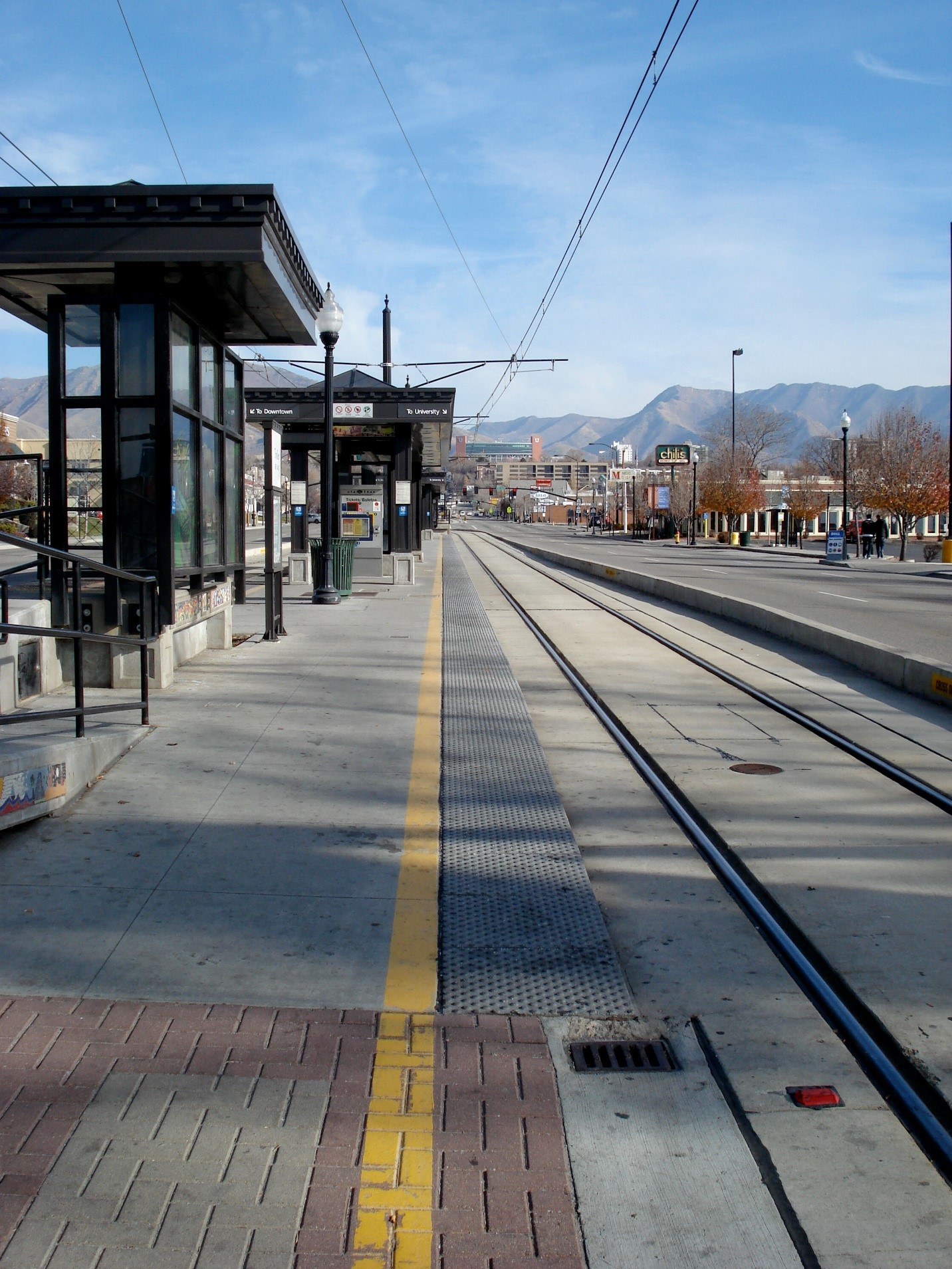
Trolley Station – Salt Lake City, UT
Perhaps trying to moving past this mistake, the new shelters proposed for the 2013 North Temple Bridge/Guadalupe Station (which serves both light rail and commuter rail) in Salt Lake City are decidedly different. The design by Hatch, Mott MacDonald, offers some excellent characteristics.

First, the shelters are narrow at the base to avoid clutter and to allow for easy circulation and safety. They are porous to allow movement from side to side. They have wide spanning canopies for good weather protection. They drain to the center, so that water doesn’t land on passengers’ heads. They allow for some natural light to come through, are simple, and basically get out of the way to allow for views of mountains and cityscape. And lastly, the name of the station is positioned below the canopy where it can be read easily by people on the platform and in the train.
SMART’s Option 2 shelters literally offer none of these important features.
Where to Go Now
For SMART, it’s been a continuous climb down on stations. They began with a professional design led by an architecture/engineering firm with transit experience, not unlike Hatch, Mott, MacDonald.
Then, SMART turned the design of stations over to its construction contractor, Shimmick. Now, they spear to be doing something even worse, taking hail-mary design advice from the Sonoma County Transportation Authority (SCTA), a funding agency with no transit operations, railroading, or architectural experience. It’s the SCTA who suggested the Option 2 bus shelters.
Cities along the rail line should not take the SCTA’s recommendation and should rally around shelter Option 1 for the good of the SMART’s system. While imperfect, it at least avoids the serious problems presented by shelter Option 2. If painted a more neutral color than the proposed forest green, it could be a respectable piece of station furniture.
Of course, while it may be too late, the best long-term outcome for both the riding public and taxpayers would be for SMART to implement a truly professional shelter design that considers the myriad details of the customer experience.


